Saturday, December 18, 2010

Travels in Europe - Prague

One of the best things about going on exchange is travel.  Being in Germany, the heart of Europe means I can pretty much go anywhere pretty easily.  The first big trip I made was to Prague last month, here are some highlights.

German Wings, a German budget airline, has an old school marketing campaign involving hot air hostesses.  None of them actually look like that.

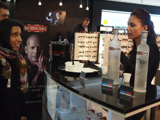
Free vodka samples at the airport? Ah Eastern Europe.

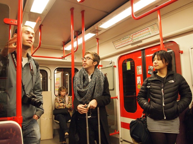
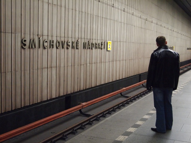
Gloomy subways.

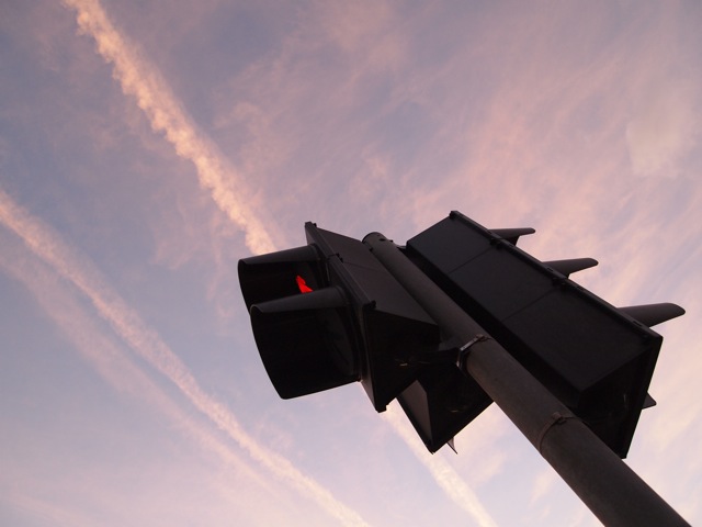
Very Eastern Europe-y weather.  Cloudy red skies..

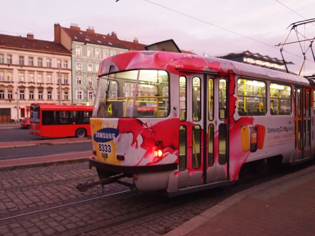
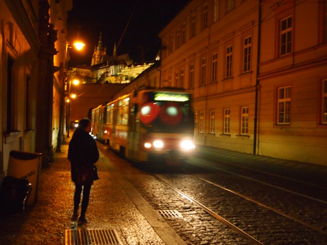
Old school trams.

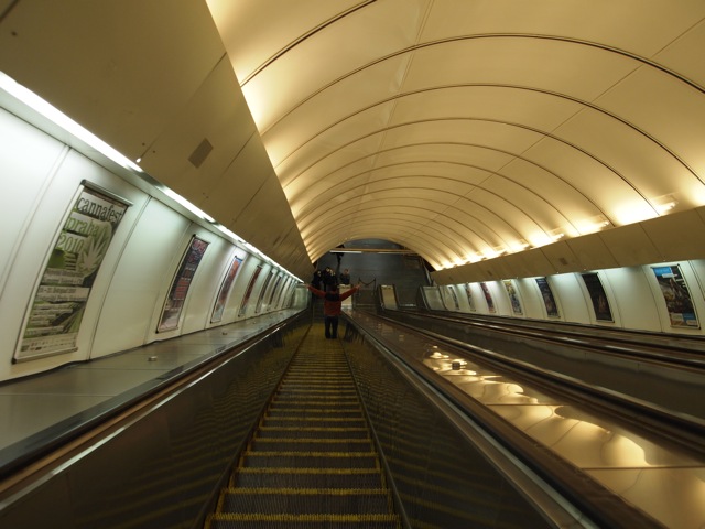
Prague has the longest and fastest escalators I've EVER been on.

Walking to the Prague castle.

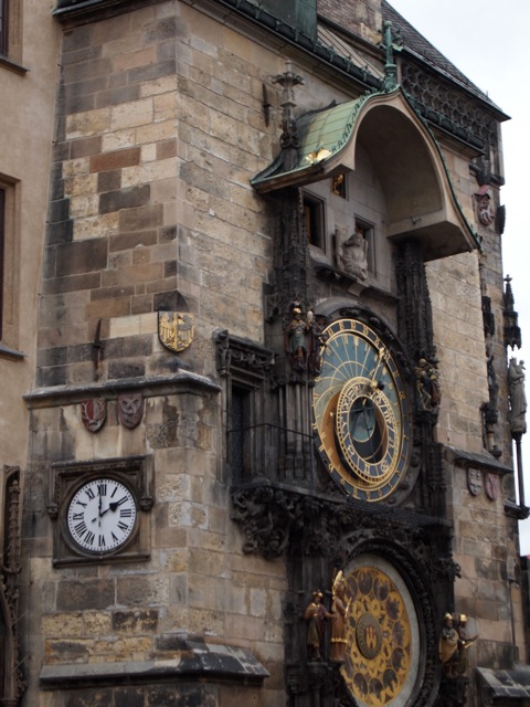
The Astronomical Clock in the old town square.  Every hour theres a little mechanical performance and a trumpet blown.

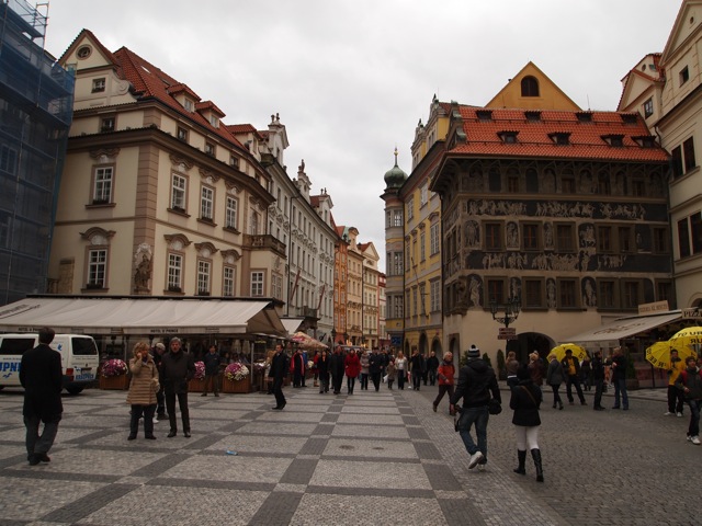
The old town square.

The green fairy.  And her red, blue, and yellow friends.

I love the Prague subways signage.

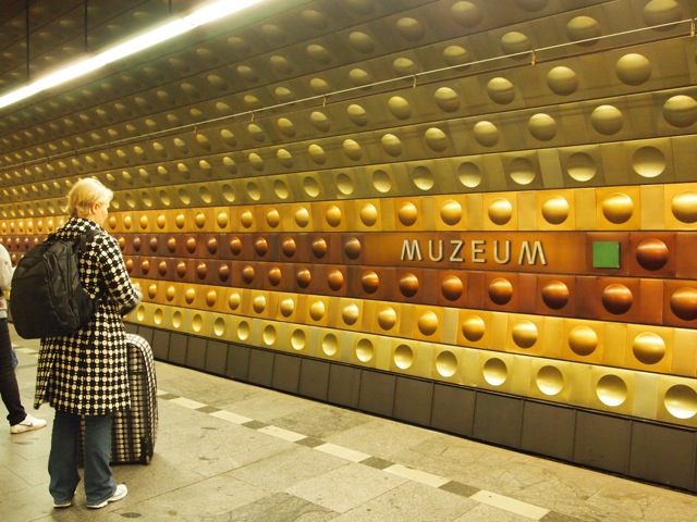
They got some crazy space age-y deco in some subway stations.

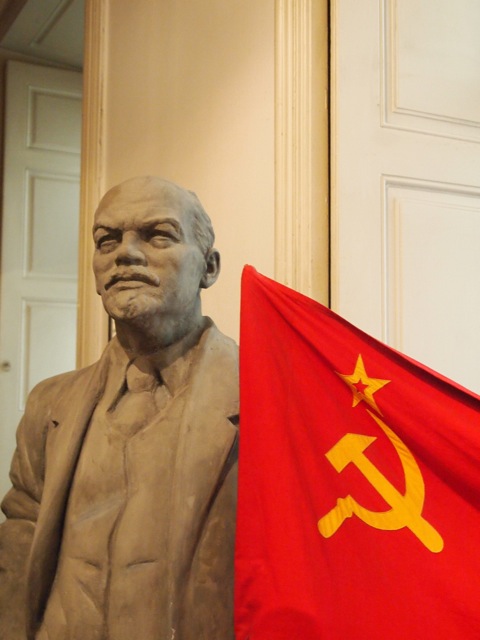
The Museum of Communism.  Hey Lenin.

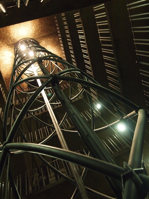
Inside the clock tower in the old town square.

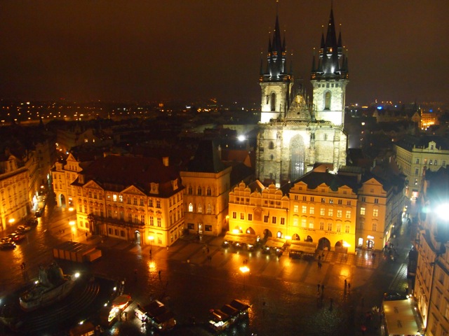
View of the old town square from the top of the tower.  Prague is beautiful.

Tuesday, December 14, 2010

IDEO C60 Redux

So....I look at my blog after a few days of not checking and theres a post there that I didn't post....that TED talk video down there.  Noooo idea how it got there, but it looks interesting so I'll leave it there.

Anyway, this popped up on Core77 a few days ago.  Its the IDEO C60 Redux concept.  I first saw this when I read "I Miss My Pencil" by Martin Bone and Kara Johnson of IDEO.  I have to say it was a beautiful book, filled with great pictures, humorous text, and of course thought-provoking concept designs.

This particular concept really stuck with me because I love music, and I love vinyls and the physicality of music.  I am a DJ and own two turntables, though I don't use them much for performance anymore.  Even still, nothing beats the feeling of manipulating music with your hands and really feeling it.  This IDEO concept aims to bring some physicality back to music in a digital way, while keeping modern benefits such as playlists and shuffling.

I stole some pictures from Core77, they say it all.  And also a video from Vimeo.


Love it.  I want one.

Tuesday, December 7, 2010

Ramazzotti project wraps up

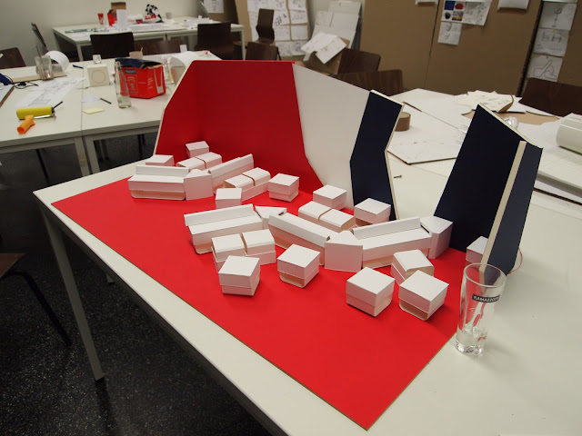
Well, sorry for the lack of updates lately (not that I think anyone really reads this, but blogging rule #1 is write like everyone is reading so....).  Anyway, after a couple more rounds of models, and one concept being worked on by the whole class and then presenting it to the client, the Rammazzotti project has wrapped up.  Unfortunately, I was not very happy with the outcome.  Working in a team of 20+ people with different skills and different levels of motivation is extremely hard and I feel like the professor did not guide us well.  We basically had 4 different concepts mashed into 1, resulting in an incoherent and unconsidered design.  The client never actually gave detailed feedback, and in fact never saw the design in progress (he sent 3rd parties to look for him), only the final.  Needless to say, in the end he was not very happy.  While this lounge was originally planned to be actually realizd, now I am not so sure.

I have one very applicable quote for this project:

A camel is a horse designed by committee.

Another round of models happened after my last update.

One of the other notable concepts, involving a giant arc installation.

Another concept involving a tree-like visual center and rounded furniture.

The final iteration of our concept before it was merged.  First feedback meeting with client's subordinates.  Too late.

Me presenting our concept.

After each concept was evaluated, we shuffled around again, tasking people to work on the best aspects of each concept.  I was tasked with working on this arc installation, which I found quite interesting actually.

The installation involved a metal frame covered in a canopy of these polypropylene elements.  I helped to develop the shape, arrangement, material selection, and construction methods.  Oh about the shape, its the "Ramazzotti shape", which is actually the shape of the bottom of their glasses.  We exploited this shape to the MAX.
Building a 1:3 model.  We only built half the arc to make it easier.  This is the frame, anchored in the ground and suspended from the ceiling.

Shapes going on, attached with zip ties as it would be in the real thing.

Each shape would have a small logo detail to add a touch of branding.

The groups building 1:3 furniture from MDF.  

More furniture.  Ugly furniture (in my opinion), I must say.

Our 1:3 models begin to come together.  That tower-like thing is supposed to be a "visual-center" for the lounge.  Does not match anything at all if you ask me.  In fact, nothing in this lounge matches anything else in it.

Setting up on the day of the presentation.

The client from Rammazzotti (purple shirt guy).  Doesn't look happy does he?

Again, I sense skepticism.


This was quite a disappointing project for me I must say, and I am glad its over.  The main flaws as I see it were this:
- Too many people in the project
- Too many differing skill levels and motivation levels
- A general lack of knowledge about manufacturing techniques
- Too many different concepts
- An unguided and seemingly arbitrary process 
- Trying to mash 4 concepts into 1, resulting in complete incoherence

Hey, I guess I did learn something.  Not to do all the above.
Sorry, I'm frustrated as you can tell.

Designer out.
Sunday, December 5, 2010

Coroflot Overhaul

Sooo.....my Coroflot profile is getting a pretty major overhaul and you should all check it out! I'm going to be putting up my work on this blog as well as separate stand-alone pages too.  Until then check out my work
HERE

Wednesday, December 1, 2010

Crunch Time

I'm falling so behind on updates on this blog....Ironically due to the content of the posts that will (hopefully) soon be ON this blog.

Designer lessons recently learned:
#1 Always have your camera on you
#2 Take pictures of EVERYTHING
#3 Always have a spare camera battery...

Tuesday, November 23, 2010

Test Image

So I've noticed that my pictures look very desaturated on this blog, and I think it may be to do with the file sizes I'm uploading and blogger downgrading the quality.  So here I am, doing a test uploading a super saturated photo in original size, and then a resized version to see which looks better.

I can see almost no noticeable difference....the mystery continues...

EDIT: Soooo....somehow it is Google Chrome that is dulling down my colors...Everything looks bright and nice in Safari....what gives?

Saturday, November 20, 2010

Ramazzotti Update

Here are some updates on my project to design a lounge for the Italian liquor company Ramazzotti.  I left off when the larger class had split into smaller groups, and here is the development process of our group's concept.


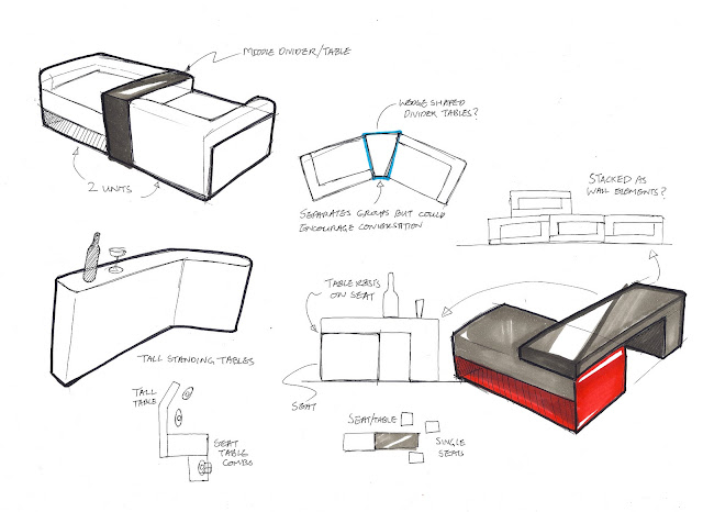
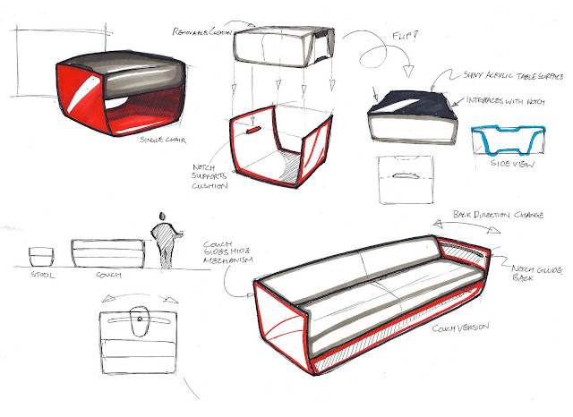
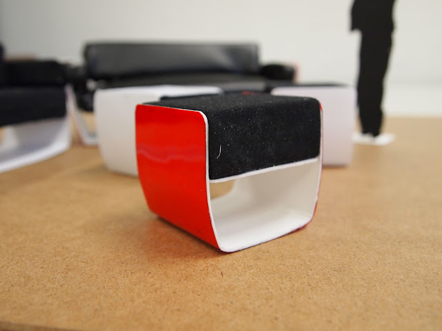
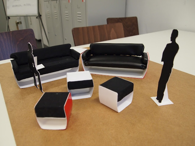
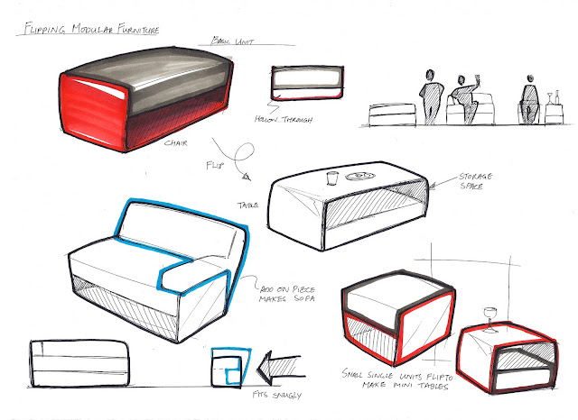
My Contribution to our concept was an idea of modular, multipurpose furniture.


I wanted the furniture to have a modern feel while having an element of class. 
The idea for the furniture stuck, and I refined it to fit into our final concept.
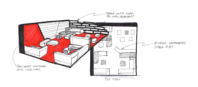
We paid a lot of attention to how our lounge concept would be laid out.
A 1:10 model for the first iteration of our concept.
Our next iteration, with refined furniture models.
A small part of our second iteration, showing how the layout creates a small group space.

More to come soon!


Thursday, November 4, 2010

ORGATEC Working Spaces Exhibition 2010

One great thing about being here in Cologne is the giant exhibition space at Messe Deutz which brings in loads of really cool exhibitions every year.  Just being here over 2 months I've seen two awesome exhibitions that have really interesting design-wise.  Here are some highlights from the ORGATEC Working Spaces exhibition 2010 I went to last saturday.

These chairs greeted me near the entrance.  The look like hard plastic but....

...they're actually really squishy and comfortable.  I later saw the booth of the manufacturer and the chair is made from a process of coating furniture foam in some kind of plastic.


This office stationery really reminds me of Apple's Macbook.  Their marketing posters were pretty similar to Apple too....Managed to snap this pic right before they said NO PHOTOS.
A crazy chair testing contraption on display to show how strong their chairs are I guess? It basically continuously stresses the chair in all directions with various pneumatic devices.  I would not want to be stuck in that machine... 
Some pretty crazy booth designs!

A cool multifunctional couch with repositional seat backs and small table element.

I love red.
I love red phones.
I like this clock too.
This place was just a carpet company, but they had a very exciting booth.  
I love the way their carpet interacts with the environment and objects in their booth design.
A wall made of chairs!

Vitra didn't like photos either...but I managed to snap a few....
Exploding chair!!!
Herman Miller had a very organic looking space. 
The walls were stretched fabric! They look so solid!  Apparently this is a very popular form of construction for trade fairs and exhibitions.
The new SAYL chair.
Herman Miller had the best free food....